We talk bathrooms and renovating with the Californian Homme Boys
We all love a house makeover, and no one does it better then the Californian Homme Boys. Their mid-century, yet contemporary style is the perfect balance of old and new, creating a home that feels both modern and warm. We chatted to Austin and Alex about the renovating process and how to achieve luxury in our bathrooms on a budget. Read the interview below and see inside this inspiring Californian home.
Describe your overall style in the home?
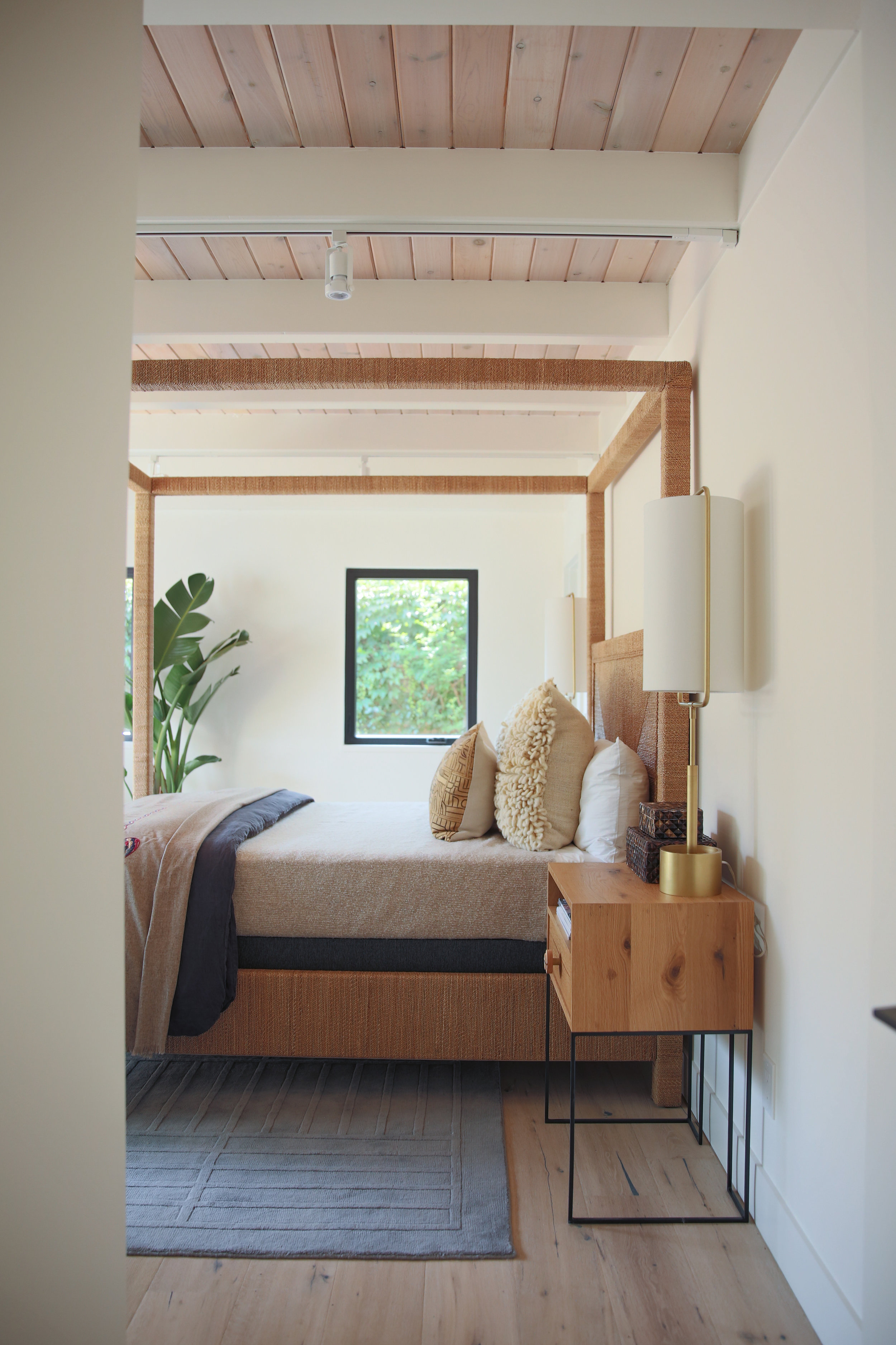
The house was an original mid-century modern home built in 1951 in the heart of Sonoma, CA. When we chose to renovate and rebuild parts of the home we wanted to pay homage to the original style while taking a more contemporary feel. We wanted the inside of the home to have a very warm feel and open floor plan to engulf the indoor/outdoor lifestyle. We brought in more modern fixtures while keeping the whole space warm in the finishes from the floors to cabinets.
Where do you draw inspiration from?
We get inspired from almost anything and everything, everywhere and most specifically nature. We are serial photographers of restaurant bathrooms, we surf the gram for new design ideas daily and even go the old school route and buy the odd end design magazine or two. Our personal style is like the seasons, so we have to constantly be inspired to keep up with the change. You never know what your going to look at and fall in love with next, so keep your eyes open and take it in.
Talk us through each of the Bathrooms you renovated and styled.
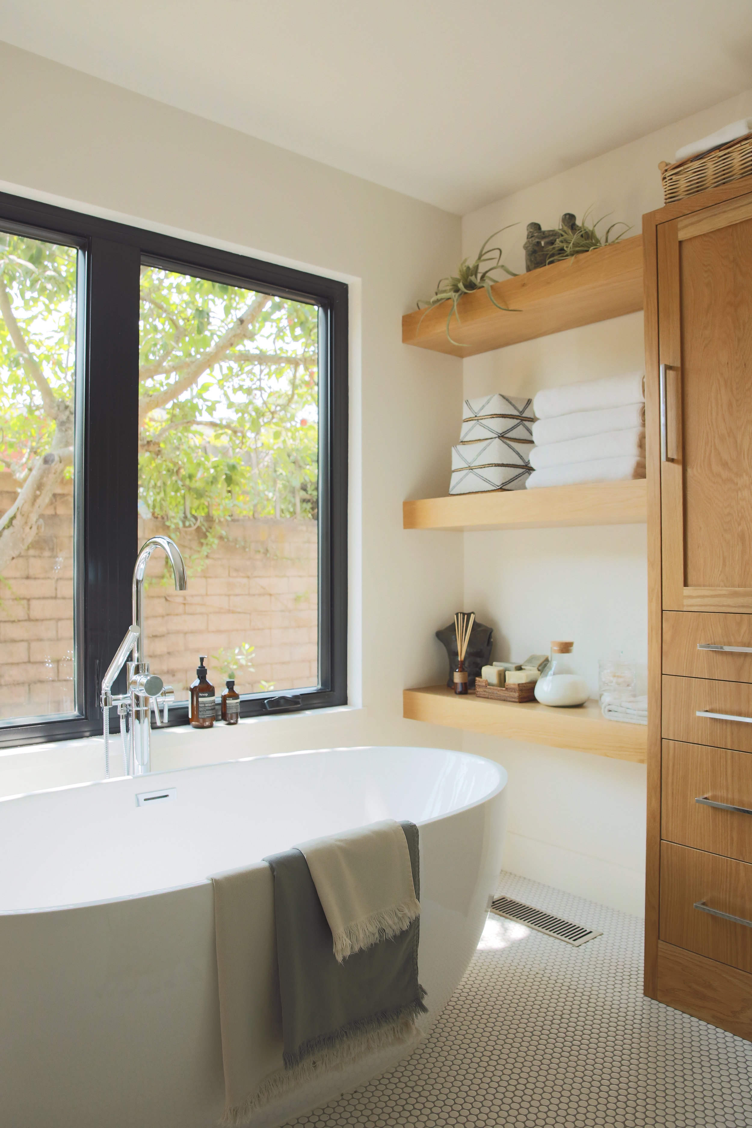
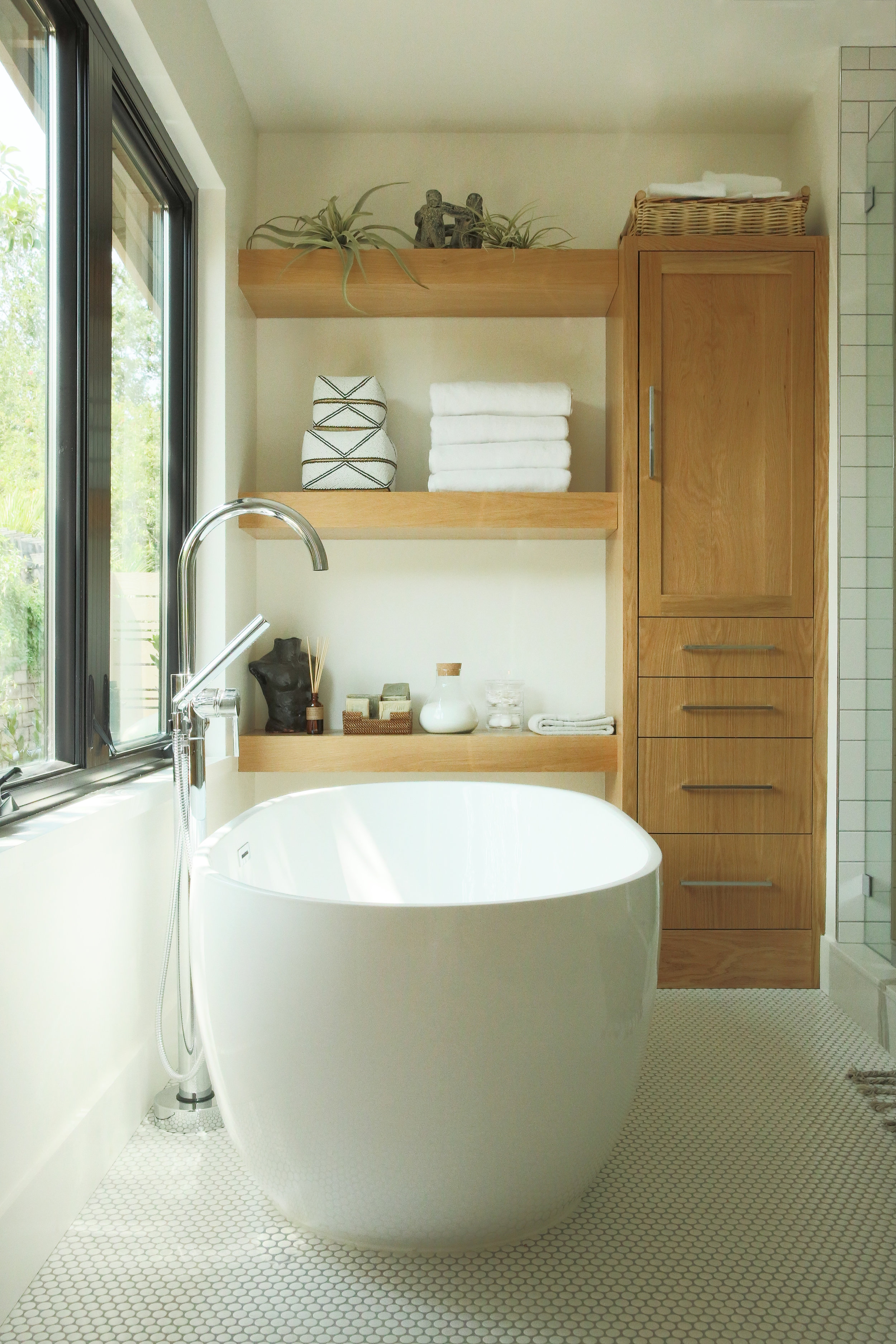
The Master Bathroom - The master bath had to spell out luxury. We chose to use different layers of whites while bringing in warm and crisp tones. The round penny tile floors, to the chevron subway tile walls made the space bright and open, while the custom oak cabinets and modern chrome fixtures created a space that felt comfortable. The accents in the room came through in the sculptural aspects, linens and unique bath products placed throughout the space.
Pictured here, our Stonewash Bath Sheet in Clay, Bath Towel in Ash and Hand Towel in Clay. Shop here.
The Ensuite Guest Bathroom - This bathroom was one of contrast. We used black hexagon tiles with a thin white subway tile military stacked up the walls. The striking difference in colours, with natural birch cabinets gave a relatively simple room a lot of pop and character, it felt more fun yet classy and timeless. The vessel sink marks the centerpiece of the room while being accentuated with the dramatic matte black fixtures.
Pictured here, our Dreamer Travel Towel. Shop here.
The Main Living Space Bathroom - The main living space bathroom is going to have the most traffic so we wanted to create a very simple and clean look. We picked large format tiles in a natural washed stone to give the room a clean and earthy feel. The skylight over the shower was key, the bathroom was centralised in the house and natural light is a must in bathroom spaces.
Pictured here, Stonewash Bath Sheet, Bath Mat, Hand Towel and Wash Cloth in Indigo. Shop here.
What are your favourite elements of each of the bathrooms?
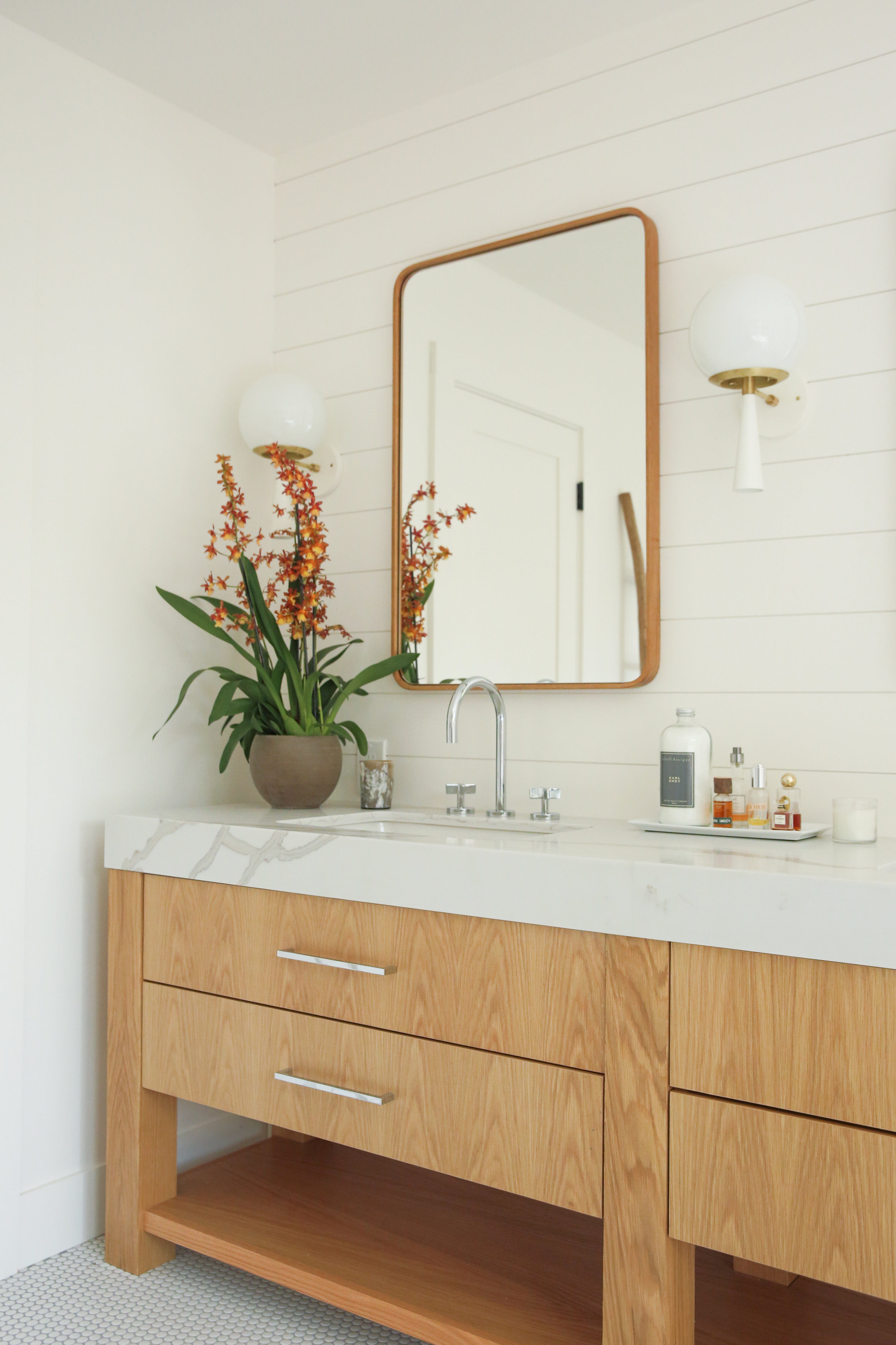
Something we pride ourselves on are our own custom cabinets. We are our own cabinet shop which allows us to really get creative with the way the tile and the natural wood elements commingle. We chose very stark tile colours to mix with clear coated natural woods to make each room unique, modern, and warm while creating a central common theme throughout the house. That creative flexibility really takes the cake when you want a room to feel cohesive and allows us to almost do whatever we know is right for the space.
What was the most difficult part of renovating?
The most difficult part of renovating is the waiting. Hah! But Seriously. We constantly find ourselves saying ”we can't wait” for the next finished surface to be installed. Each application of tile, stone and cabinet leads to more excitement and anticipation of the finished vision coming together. Then on the final day mirrors, lights and fixtures go in and your heart just skips a beat. It's worth the wait!
Renovating can be a little overwhelming and expensive, are there any corners we can cut?
Our advice is to plan, budget and then triple check every decision you've made! No, but really there are a few ways to save here and there. One way is that most of our money goes into areas that you don't see in the end because of the cost of construction. If you're on a strict budget but want the space to feel different, then replacing cabinets and fixtures can make a huge change without moving around toilets and sinks which can be costly. Also, painting and wall papers can make the biggest bang for your buck. Hygge and West actually has a line of Heath Ceramics Tile wallpaper that gives the look of tiled walls with the cost of putting up paper. Win Win!
What’s the best way to make a bathroom feel luxurious if you can’t renovate?
Ok! This has literally been the only way we could make our own bathroom feel luxurious, up until recently because we are actually now renovating our very own bathroom. The littlest things can make a big difference! We have three: Aesop skincare (yes its pricey, but it's seriously incredible and looks damn sexy), unique ceramic pieces (gives character and warmth to a space) and linens (towels, towels and oh, did I mention towels?). Our favourite bath towels are the whole line of Stonewashed Bath Towels from The Beach People. We hoard them! We have every towel in every colour and they are always our go to, to class up a joint.
For anyone renovating, what are some of the trends that we should buy into that are here to stay?
To be honest, you can't really go wrong with subway tiles. There are so many different patterns from chevron, military stack, brick lay, etc and they always leave the room feeling bright and refreshing. Once you get into colours you can make your space whatever you want, but our rule of thumb is always start white and move forward from there. A white bathroom is timeless, classic and will always leave you feeling clean!
Pictured here, the Dreamer Travel Towel. Shop here.
Shop the Hommeboys edit


